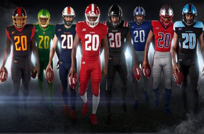
In January of last year, Vince McMahon announced the revival of the XFL. The league, which will begin play in 2020, will be dissimilar from its predecessor in that it’ll be less “Xtreme” and more football.
One part of that shift to a realer style of football is the exclusion of nicknamed jerseys. While Rod Smart’s “He Hate Me” is one of the most recognizable jerseys in all of sports. We won’t see anything like it in the new XFL in the foreseeable future.
But, without the gimmicky name plates, the XFL must look elsewhere for both branding and income. Leagues can become synonymous with team’s jerseys (think the iconic maroon and blue patterned kits of La Liga’s FC Barcelona). More importantly, jersey sales account for a large portion of teams’ revenue. As such, the XFL franchises need strong jerseys. Let’s have a look at all eight kits.
8. Tampa Bay Vipers
What an absolute shame. There’s a lot of potential with snake-based designs, but the color scheme just kills these unis. The two different shades of green on the away set create a disgusting Oregon Ducks knockoff, and the lime helmet just destroys any potential appeal of the homes.
7. Houston Roughnecks
If the 2000-04 Cowboys had worn the colors of the 1984-88 Patriots, you’d have a good mock-up of the Roughnecks’ jerseys. The massive star on the shoulder is a little too reminiscent of a hockey jersey, but that’s redeemed by the front collar logo. “Chrome dome” helmets are hit or miss, and here they look out of place with the vibrant red prevalent in both jerseys.
6. Los Angeles Wildcats
If the Wildcats had even serviceable colors, this could be an All-Time uni. Down the sides and across the length of the helmet are tapered lines mimicking claw tears, a look which feels almost collegiate, but it works. The XFL isn’t a direct competitor with the NFL, so they can be a little more liberal and less professional with their design choices. The semi-serifed font for the numbers looks absolutely gorgeous, but creamsicle orange peaked with the Buccaneers, and this attempt to replicate the success falls flat.
5. Dallas Renegades
The Renegades have the best helmet in the XFL, maybe all of football. Despite this, Dallas gets knocked for ripping their design straight from the Tennessee Titans. Aside from that, the solid black aways look sloppy and could’ve been improved ten-fold by opting in for baby blue pants.
4. St. Louis BattleHawks
There’s nothing to love, nothing to hate about the BattleHawks’ uniforms. The helmets stand out with a call to the Philadelphia Eagles winged helmet concept. Aside from that, St. Louis has a bland set that you’d find used by a high school football team.
3. New York Guardians
In the video announcing New York’s team name, a voiceover recalled images of stoic gargoyles watching over the city like a, well, guardian. “Sentries carved of stone,” it said. “They are your first line of defense, and there is no need for a second.” That’s what these uniforms convey. They’re strong, imposing. There’s nothing special, but it gets the job done.
2. D.C. Defenders
Despite the shoulder and leg patterns feeling a little Chargers-like, there’s nothing to dislike about this look. When done properly, matching jerseys and pants look incredible, and this is a perfect example.
1. Seattle Dragons
Look at these beauties. Dark blue and green is a difficult combo to pull off, but it works well here. The home set looks very Miami Hurricanes-esque, but what sends the Seattle looks over the top are the helmets. The solid stripe down the middle is a great touch, but the best part is the logo. The Dragon logo begins at the bottom of the helmet and takes up the entire side, a format unused elsewhere in the XFL, or the NFL, for that matter.
What do you think about the XFL jerseys? Will you be buying your local team’s kit anytime soon? Let me know on Instagram, @zekepersources.

